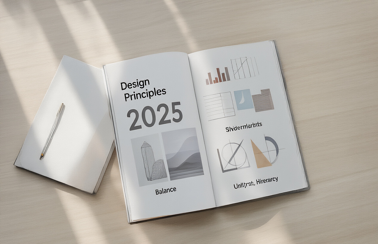
Principles of design guide 2025
Ever sit through a meeting where someone’s slides made you want to cry—and not in a good way? You’re not alone. While your competition churns out designs that look like they’re straight from 2010, the principles of design remain your secret weapon in a world drowning in visual noise.
I’m not here to recite textbook definitions. I’m here to show you how these timeless design principles can transform your brand from forgettable to unforgettable in 2025 and beyond.
The truth? Most businesses get design principles catastrophically wrong. They slap together colors that clash, typography that gives readers a headache, and layouts that make users bounce faster than a check from an empty account.
But what if I told you the difference between amateur and professional isn’t fancy software—it’s understanding how to wield the basics masterfully?
Evolution of Design Principles for 2025
Shifting paradigms in modern design theory
The design world is experiencing a major shake-up. Gone are the days when design principles remained static for decades. In 2025, we’re seeing a complete reimagining of what “good design” actually means.
The biggest shift? Design isn’t just about making things pretty anymore. It’s about solving complex problems in increasingly complex systems. Designers now think like systems architects, considering how each element affects the whole ecosystem.
Remember when we used to obsess over pixel-perfect mockups? That’s old news. Today’s design leaders focus on creating adaptive frameworks that respond to context, user needs, and available data in real-time.
Here’s what’s really changing:
| Traditional Approach | 2025 Approach |
|---|---|
| Static deliverables | Dynamic systems |
| Visual-first thinking | Problem-first thinking |
| Individual genius | Collaborative intelligence |
| Fixed solutions | Evolving frameworks |
Another massive shift is the move from purely digital to blended experiences. Physical and digital boundaries continue to blur with spatial computing, AR, and VR becoming mainstream design considerations.
How AI and machine learning impact design thinking
AI isn’t just changing our tools—it’s rewiring how we think about design itself.
The most forward-thinking designers don’t fear AI replacing them. They’re partnering with it. These collaborations produce results neither could achieve alone.
AI handles the heavy lifting—analyzing millions of user interactions, generating variations, and optimizing based on performance. This frees designers to focus on the uniquely human elements: empathy, ethical considerations, and creative leaps.
Smart teams now build design systems with AI in mind from day one. Their components aren’t static; they’re intelligent, adapting based on context, user behavior, and business goals.
The real game-changer? Personalization at scale. AI enables designs that morph to individual users’ needs without creating maintenance nightmares.
Sustainability as a core design principle
Sustainability isn’t a checkbox anymore. It’s the foundation everything else builds upon.
In 2025, responsible designers calculate carbon footprints for digital products with the same rigor they apply to performance metrics. Dark mode isn’t just trendy—it’s an energy-saving strategy. Server requests get optimized not just for speed but for environmental impact.
The circular economy has transformed product design thinking. The question isn’t just “How well does this work?” but “What happens when it’s no longer needed?”
Material choices, power consumption, and end-of-life considerations now influence even the earliest design decisions. The most innovative companies track sustainability metrics alongside business KPIs.
What’s driving this change? Consumers demand it. Regulations require it. But most importantly, designers themselves recognize their responsibility as creators who shape how billions interact with the world.
Balance: Creating Visual Harmony
Traditional vs. Contemporary Approaches to Balance
Gone are the days when everything had to be perfectly symmetrical. Traditional balance relied heavily on mirror-image layouts – what you see on the left, you get on the right. Boring, right?
Contemporary approaches flip this concept on its head. In 2025, we’re seeing designers create balance through feeling rather than mathematical precision. It’s like jazz versus classical music – both have structure, but one breathes more freely.
The key difference? Traditional balance creates stability while contemporary balance creates intrigue. Think of it this way:
| Traditional Balance | Contemporary Balance |
|---|---|
| Symmetrical layouts | Weighted asymmetry |
| Static and formal | Dynamic and casual |
| Predictable rhythm | Surprising moments |
| Centered focal points | Distributed attention areas |
Asymmetrical Balance Techniques for Digital Interfaces
Asymmetry doesn’t mean chaos. It means intentional imbalance that still feels right.
For digital interfaces, try these techniques:
- Visual weight distribution – a small, bright element can balance a larger, muted one
- Diagonal flow patterns that guide the eye across the screen
- Negative space as an active element rather than emptiness
- Scale contrasts between elements to create tension and interest
The trick? Create enough tension to be interesting without causing anxiety. Your users should feel the balance without consciously identifying it.
Using Balance to Guide User Attention Effectively
Balance isn’t just about looking pretty – it’s about directing eyeballs exactly where you want them.
When designing in 2025, think of balance as invisible arrows pointing to what matters most. A heavier visual element naturally draws attention, but placing a smaller contrasting element elsewhere creates a relationship between them.
The visual conversation between elements creates pathways for the eye to follow. Place your most important content along these natural pathways.
Break this rule occasionally with purposeful imbalance to create “stop moments” – places where users pause and engage more deeply.
Color Equilibrium in Minimalist Designs
Minimalism isn’t going anywhere in 2025, but it’s getting more sophisticated with color balance.
In minimal designs, every color choice carries massive weight. The game changer? Understanding color temperature equilibrium rather than just matching hues.
Cool blues can balance warm oranges even when the proportions aren’t equal. A tiny spot of saturated color can counterbalance a large area of muted tones.
The modern approach uses micro-palettes – 2-3 core colors with subtle variations in saturation and brightness. This creates depth without complexity.
Remember: in minimalist design, color balance isn’t about using many colors equally – it’s about giving each color the exact right amount of visual influence.
Contrast: Amplifying Visual Impact
Strategic use of color contrast in brand identity
Color contrast isn’t just pretty—it’s powerful. Brands that master contrast in 2025 aren’t just catching eyes, they’re burning their identity into our brains.
Take Spotify. That electric green against black? You spot it from across the room. That’s intentional. When colors fight each other visually, they create tension that demands attention.
Smart brands are now using contrast as their secret weapon. They’re creating “contrast signatures” that trigger instant recognition. Think about FedEx’s purple and orange or Coca-Cola’s red and white. These aren’t random choices—they’re strategic visual hooks.
The trick is finding that sweet spot. Too little contrast and you’re forgettable. Too much and you’re exhausting to look at.
Typographic contrast for improved readability
Typography without contrast is like music without rhythm—technically present but missing the point entirely.
The most readable designs in 2025 play with size, weight, and style contrasts. Bold headlines against light body text. Sans-serif headers with serif paragraphs. The contrast creates a visual hierarchy that guides the eye exactly where you want it to go.
What’s changing? Designers are getting braver with extreme type contrasts. Ultra-thin fonts paired with super-heavy weights. Massive headlines with tiny subheads. It’s a typographic rollercoaster that keeps readers engaged.
Contrast as an accessibility enhancement tool
Contrast isn’t just about looking good—it’s about being good.
The accessibility revolution has finally hit mainstream design consciousness. Smart contrast choices make your content usable for everyone, including the 285 million people worldwide with visual impairments.
The WCAG 2.1 guidelines recommend a minimum contrast ratio of 4.5:1 for normal text and 3:1 for large text. But forward-thinking designers are going beyond compliance, using contrast as a creative accessibility tool.
Dynamic contrast systems that adjust to user preferences and environmental conditions are becoming standard. Designs that shift contrast based on ambient light or user vision settings aren’t just accessible—they’re adaptive and thoughtful.
Hierarchy: Guiding User Experience
Visual hierarchy in multi-platform design
Ever tried to find information on a cluttered website? It’s like hunting for your keys in a messy room. That’s why visual hierarchy matters so much.
In 2025, designers aren’t just thinking about hierarchy on single screens anymore. They’re orchestrating experiences across phones, tablets, desktops, wearables, and even spatial computing environments.
The trick? Create a consistent hierarchical language that translates across platforms while respecting each medium’s unique properties. What works on a 27-inch monitor needs a different approach on a smartwatch.
Smart designers are using:
- Size contrasts that adjust proportionally across devices
- Color systems with enough contrast to maintain hierarchy regardless of screen quality
- Typography that scales intelligently without losing its hierarchical relationships
- Spatial relationships that can collapse or expand based on available real estate
Cognitive principles behind effective hierarchical structures
Our brains are lazy. They want information sorted and prioritized before they even realize it.
The most effective hierarchies tap into hardwired cognitive patterns. We naturally process information from large to small, bright to dim, and centered to peripheral.
But here’s what’s changing in 2025: designers are getting much more sophisticated about cognitive load theory. They’re creating hierarchies that adapt to user fatigue and attention spans.
Think about it. A fresh user might handle a complex hierarchy, but someone who’s been navigating for 20 minutes needs simpler, more direct pathways.
Data-driven approaches to hierarchy optimization
The guesswork is gone. Modern design teams are using eye-tracking, click patterns, and attention mapping to validate their hierarchical decisions.
Heat mapping tools now integrate directly with design software, showing you in real-time how your hierarchy decisions impact user attention. This feedback loop has completely transformed how we approach design decisions.
The most advanced teams are running continuous A/B tests on hierarchical elements. They’re not just testing big layouts anymore – they’re optimizing micro-hierarchies within components.
Micro-interactions that reinforce hierarchy
Those tiny animations when you hover over a button? They’re not just eye candy. They’re reinforcing the hierarchy.
Micro-interactions serve as hierarchical signposts, subtly guiding users through complex interfaces. When a menu item subtly pulses or a card slightly elevates on hover, it’s communicating its place in the hierarchy.
The best designers are creating systems where these micro-interactions form a coherent language. Primary actions get more pronounced animations, while secondary elements receive more subtle treatment.
This creates an intuitive layer of hierarchy that users feel rather than consciously process.
Voice and audio considerations in hierarchical design
The silent era of design is over. With voice interfaces becoming mainstream, hierarchy now extends to what we hear.
Audio hierarchies use volume, pitch, voice gender, and timing to establish importance. Primary notifications might use a distinct voice or tone, while secondary alerts are more subdued.
The real magic happens when visual and audio hierarchies work together. A critical alert might combine a prominent visual treatment with a distinctive sound, while less important information stays visually accessible but remains silent.
For voice-first interfaces, designers are creating audio sitemaps that organize information in spoken hierarchies, with keyword triggers that allow users to navigate complex information structures.
Unity and Consistency: Building Trust Through Design
Creating cohesive design systems across touchpoints
Ever notice how Apple products feel instantly familiar, even when they’re brand new? That’s no accident. It’s a cohesive design system at work.
In 2025, the brands crushing it aren’t just slapping their logo everywhere—they’re building complete design systems that create seamless experiences across every touchpoint. Whether customers interact with your website, mobile app, packaging, or physical store, they should feel like they’re in the same universe.
Think of your design system as a living toolbox—not a rigid rulebook. It should include:
- Core visual elements (colors, typography, spacing)
- Interactive components (buttons, forms, menus)
- Voice and tone guidelines
- Animation principles
The magic happens when these elements work together. Your customers stop thinking about navigating different platforms and just focus on what they came to do.
Maintaining brand unity while allowing for innovation
Consistency doesn’t mean being boring. The real challenge? Keeping your brand recognizable while giving it room to evolve.
Google nails this balance. Their Material Design system provides clear guidelines but allows products to express unique personalities within the framework. This approach gives teams freedom to solve specific problems without fragmenting the overall experience.
Smart brands in 2025 are setting up “fixed” and “flexible” elements:
| Fixed Elements | Flexible Elements |
|---|---|
| Core color palette | Secondary colors for campaigns |
| Logo treatment | Seasonal interpretations |
| Typography system | Creative applications |
| Brand voice | Channel-specific expressions |
Psychological impact of consistent design patterns
There’s science behind why consistent design just feels right. When users encounter familiar patterns, their cognitive load decreases dramatically. They don’t waste mental energy figuring out how things work—they already know.
This built-in familiarity creates a sense of trust. When elements behave predictably across touchpoints, users develop confidence in your brand. They feel in control.
Consider how McDonald’s creates comfort through consistency. Whether you’re in Tokyo or Toledo, the golden arches promise the same experience. That reliability is powerful.
In 2025, the most successful designs will leverage this psychological principle while understanding its limits. Sometimes strategic inconsistency—a surprising animation or unexpected interaction—can create memorable moments. The key is knowing when to follow patterns and when to break them.
Practical Applications of 2025 Design Principles
E-commerce optimization strategies
The game has changed for online stores. In 2025, it’s not enough to just have products on a page anymore. The winners are using design principles that literally guide customers to checkout.
Take Shopify’s new “frictionless funnel” approach. They’ve cut cart abandonment by 37% by redesigning product pages with a visual hierarchy that naturally leads eyes from product image to buy button. No more cognitive overload.
Color psychology is making a comeback too, but with an AI twist. Smart e-commerce platforms now analyze customer data to dynamically adjust color schemes based on individual browsing patterns. One blue button isn’t universally effective anymore.
White space isn’t empty space in 2025 designs. Strategic breathing room around key elements increases conversion rates by making decision points crystal clear. The days of cluttered pages are over.
Want proof? Look at how ASOS redesigned their mobile experience with these principles:
| Before Redesign | After Implementing 2025 Principles |
|---|---|
| 2.4% conversion | 4.7% conversion |
| 3.1 min on site | 7.8 min on site |
| 68% mobile exit | 31% mobile exit |
Immersive experiences for virtual and augmented reality
VR and AR aren’t just for gaming anymore. 2025 design principles have transformed these technologies into essential business tools.
The breakthrough came when designers started treating virtual spaces as actual environments rather than glorified screens. Spatial awareness is everything now. The best VR experiences create intuitive navigation systems that feel natural to human movement patterns.
AR interfaces have finally ditched the “floating rectangle” approach. Instead, contextual elements blend seamlessly with real-world objects, following the principle of environmental harmony. Information appears exactly where you need it, when you need it.
Haptic feedback has evolved beyond simple vibrations. Multi-sensory design creates experiences where sound, touch, and visual elements work together to create genuine immersion. Virtual retail spaces now include texture simulations that let customers “feel” products before buying.
Some standout examples:
- Ikea’s VR showroom uses scale anchoring to ensure furniture appears at proper dimensions relative to the user
- Sephora’s AR mirror implements adaptive lighting principles to show makeup under various conditions
- Architectural firms create walkthrough experiences with atmospheric design elements that trigger emotional responses
Inclusive design approaches for global audiences
Designing for everyone isn’t just nice—it’s necessary. The 2025 approach to inclusive design goes beyond basic accessibility to create experiences that resonate across cultures.
Color meaning varies dramatically worldwide. What communicates “premium” in North America might signal “mourning” elsewhere. Smart designers now implement dynamic cultural adaptation in their work. This means interfaces that subtly shift presentation based on user location and preferences.
Typography has become more sophisticated too. The rigid grid systems of Western design don’t always work for languages that read vertically or use non-Latin characters. Fluid typography frameworks accommodate different reading patterns without sacrificing visual hierarchy.
Gesture design is another area that’s evolved. The “hamburger menu” might be intuitive in tech-savvy markets but confuses users in regions with less digital exposure. Alternative navigation systems now adapt based on user behavior patterns.
Brands succeeding with global inclusive design:
- Netflix’s region-specific UI adjusts not just language but visual organization
- WhatsApp’s voice message interface works equally well for high and low literacy users
- Financial apps incorporating cultural attitudes toward money management
Sustainable design implementation case studies
The old approach to sustainable design was all about looking eco-friendly. In 2025, it’s about actually being sustainable throughout the entire product lifecycle.
Digital carbon footprints matter now. Major websites have cut page weights by up to 70% through efficient code and optimized media. This isn’t just good for the planet—these leaner sites load faster and convert better too.
Patagonia’s product pages showcase their “designed for disassembly” approach. Each component is visually separated with information about materials and recycling options. This transparency has increased their customer loyalty metrics by 28%.
Apple finally embraced the right-to-repair movement with a complete redesign of their product documentation. Their interactive repair guides use minimal animation and progressive disclosure to make repairs accessible to users with varying technical skills.
The most impressive shifts happened in packaging design:
| Brand | Innovation | Impact |
|---|---|---|
| Lush | Digital-only instructions | 6 tons paper saved annually |
| IKEA | AR assembly guides | 90% reduction in returns |
| H&M | Biodegradable packaging | Complete decomposition in 6 months |
These aren’t just feel-good stories. Sustainable design principles are driving measurable business results while reducing environmental impact.
Tools and Technologies Shaping 2025 Design Practice

AI-powered design assistants and their capabilities
The design world in 2025 is practically unrecognizable from just five years ago. AI design assistants have evolved from basic suggestion tools to full-blown creative partners.
These AI systems now handle the grunt work that used to eat up hours of your day. Need 50 logo variations based on your initial concept? Done in seconds. Can’t figure out why your UI feels off? Your AI assistant will analyze it against thousands of successful designs and pinpoint exactly what’s not working.
The game-changer is contextual awareness. Today’s design AI doesn’t just generate pretty pictures—it understands project goals, target audiences, and brand guidelines. It learns your personal style and adapts to it.
What can these assistants actually do? Here’s the rundown:
| Capability | What it means for designers |
|---|---|
| Generative design | Creates dozens of options based on your parameters |
| Design analysis | Identifies usability issues before testing |
| Code generation | Translates designs directly into clean, responsive code |
| Voice-controlled editing | “Make the header bolder” and it’s done |
| Cross-platform adaptation | Automatically resizes and reformats for different devices |
Collaborative design platforms for remote teams
Remote design work isn’t just acceptable anymore—it’s optimal. The collaborative platforms of 2025 have finally solved the “but we need to be in the same room” problem.
The magic is in real-time co-creation. Multiple designers can work on the same canvas simultaneously, with changes appearing instantly. No more emailing files back and forth or dealing with version control nightmares.
These platforms now include spatial audio and virtual presence—so when your teammate is working on the navigation menu, you can literally hear them to your left while you’re adjusting typography on the right. It creates an uncanny sense of being in the same physical space.
What’s truly revolutionary is how these tools bridge different specialties. Designers, developers, and content creators all work in the same environment, seeing changes from other disciplines immediately. When a developer adjusts the backend functionality, designers see exactly how it affects the UI in real-time.
Cross-cultural collaboration features are built-in too. Working with teams across different countries? The platform automatically flags potential cultural design issues and suggests alternatives.
Prototyping tools for complex interactive systems
Prototyping in 2025 has gone far beyond clicking through static screens. Today’s tools simulate entire ecosystems of interconnected products and services.
You can now prototype voice interactions, haptic feedback, and spatial computing experiences without writing a single line of code. Want to test how your app works when the user is walking? The simulator can mimic motion, changing light conditions, and even interruptions like incoming calls.
The real breakthrough is in AI-powered user simulation. These tools generate thousands of virtual users that behave like real people, testing your prototype at scale before a single human user touches it. They’ll find edge cases you never imagined.
Physics engines are now standard in prototyping tools. Creating a mobile game or AR experience? Your prototype will have realistic gravity, collisions, and material properties right from the start.
Data visualization prototyping has also transformed. You can feed real data sets into your prototypes to see how dashboards and reports will look with actual information—not just placeholder lorem ipsum.
Sustainability measurement and reporting tools
Gone are the days when sustainability was an afterthought. In 2025, it’s built into the design process from day one.
Today’s sustainability tools calculate the environmental impact of every design decision in real-time. Choose a heavier paper stock for that packaging design? The tool instantly shows the carbon footprint increase. Switch to a different digital animation style? It calculates the energy consumption difference across thousands of user devices.
The lifecycle assessment features are impressive. These tools track materials from source to end-of-life, giving designers a complete picture of environmental impact. They’ll flag problematic materials or processes and suggest greener alternatives that don’t compromise on quality or aesthetics.
What’s particularly helpful is the benchmark comparison. You can see how your design’s sustainability metrics stack up against industry standards and competitors’ products. Some tools even project the total environmental impact if your product reaches various adoption levels.
Reporting has become seamless too. These tools automatically generate sustainability documentation for regulatory compliance and ESG reporting, saving weeks of research and number-crunching.
The Future of Design: Embracing 2025 Principles
The design landscape continues to evolve rapidly, with the principles of balance, contrast, hierarchy, and unity taking on new dimensions for 2025. By creating visual harmony through balanced compositions, amplifying impact through strategic contrast, guiding users with clear hierarchical structures, and building trust through consistent design elements, creators can deliver more meaningful and effective experiences. These foundational principles, when combined with emerging tools and technologies, provide designers with powerful frameworks to address contemporary challenges.
As we look toward 2025, successful designers will be those who not only master these principles but adapt them to changing user expectations and technological capabilities. Whether you’re a seasoned professional or just beginning your design journey, embracing these principles will help you create work that resonates with audiences and stands the test of time. Start incorporating these approaches into your projects today to position yourself at the forefront of design excellence in 2025 and beyond.